Adding Inset Shadows to Cue Visitors to Scrollable Elements
It was reported in November 2016 that mobile (smartphone and tablet) web visits overtook desktop visits for the first time. As viewports shrink, designers are tasked with the challenge of fitting all of the same information their desktop site holds onto mobile devices while staying usable.
In the past I’ve created designs which feature horizontally scrollable elements. These elements include:
- Links inside header navigation
- Related products in an ecommerce product page
- Tables with a lot of columns
In desktop browsers, these container elements have a scroll bar that appears when content exceeds it’s visible width. On the major mobile browsers, however, the scroll bar only appears when you begin scrolling the element. That isn’t very helpful for indicating that there is more content tucked away that requires swiping.
Goals
There were 3 goals I wanted to accomplish with this snippet:
- Accurately show an inset shadow when content was hidden and required scrolling
- Remove the shadow when you could no longer scroll
- Show a shadow on each side when the element was scrolled in the middle
Inspiration

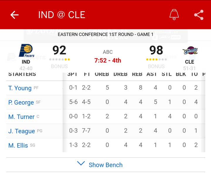
While using the ESPN app on my phone to check the box score of a basketball game, I noticed they utilize inset shadows on each end of the table to indicate whether there was more to scroll to in each direction. This UX design stuck out to me and motivated me to recreate it.
HTML Structure
The HTML structure for this project is simple but important. It requires a div wrapping the main containing div. The reason the outer div is required is for proper CSS styling. It’ll make sense in the next section.
<div class="inset-wrapper">
  <div class="inset-container not-at-right">
    <!-- whatever HTML you have inside -->
  </div>
</div>
CSS styling
The outer div .inset-wrapper is necessary for two styles. It contains overflow-x: hidden and position:relative. The styles together are important because it allows us to keep our inset shadow in place on the .inset-container div.
The .inset-container div is given overflow-x:auto to allow it to scroll, while staying within the fixed size of the parent div. The shadows are applied with :after and :before pseudo elements.
.inset-wrapper {
  position: relative;
  overflow-x: hidden;
}

.inset-container {
  overflow-x: auto;
}

.inset-container.not-at-right:after,
.inset-container.not-at-left:before {
	content: '';
  height: 100%;
  width: 15px;
  top: 0;
	position: absolute;
}

.inset-container.not-at-right:after {
	right: 0;
  background: linear-gradient(to right, rgba(0,0,0,0), rgba(0,0,0,0.2));
}

.inset-container.not-at-left:before {
	left: 0;
  background: linear-gradient(to right, rgba(0,0,0,0.2), rgba(0,0,0,0));
}
That’s the bare minimum required. Luckily, this snippet is very unopinionated of the HTML and styling used inside the scrolling container.
NOTE: This example is set up without media queries. If you only need this style on mobile viewports, I would recommend only applying the shadows in your mobile media queries. If you don’t, however, the shadows won’t show if the div doesn’t need to be scrolled.
Adding Javascript
Luckily, the sort of behavior I was trying to add can be accomplished with relatively simple Javascript code.
First, I added an id to the inset container div so we can target it with our code. Then, I set up the two variables we need.
The first variable will be used to simply target the element we want to add the shadow effect to. The second is used to track where in the div the scroll bar is by using the scrollLeft property.
var target = document.getElementById("scrollDiv");

var x = target.scrollLeft;
Next, I created a function called updateDiv which takes an argument of the current scroll position. The function defines a throwaway variable divWidth which calculates the max value target.scrollLeft can return.
Using the current scroll position argument, we can compare where in the div the user has scrolled compared to the minimum and maximum values they could scroll. This allows us to set up four simple if statements to add or remove the classes responsible for adding the inset shadows.
function updateDiv(scroll_pos) {
	var divWidth = target.scrollWidth - target.clientWidth;

	if (scroll_pos == 0) {
		target.classList.remove("not-at-left");
	}

  if (scroll_pos > 0) {
    target.classList.add("not-at-left");
  }

	if (scroll_pos < divWidth) {
		target.classList.add("not-at-right");
	}

	if (scroll_pos == divWidth) {
		target.classList.remove("not-at-right");
	}
}
Now we have the variables we need to track and the function squared away. All that is left is attaching an event listener to our target div to run our function when scrolled.
Inside the event listener function, we get the current scrollLeft value and apply it to our variable x. We can then send that updated scroll position as our argument into the function updateDiv.
target.addEventListener('scroll', function(e) {
  x = target.scrollLeft;
  updateDiv(x);
});
All put together, it looks something like this.
See the Pen Inset Scrollable Shadow by Miles Wilhelm (@mileswilhelm) on CodePen.
That’s it. This code accomplishes all three goals. It accurately displays an inset shadow when the element isn’t scrolled to a polar end and it accurately removes the shadow when it is.
Conclusion
If I were to use this in a substantial project, I would rewrite the Javascript to be object oriented and reusable. But for a one off snippet, this code works fine.